TikTok Safety Center Redesign
Project Overview
As a Product Designer, I led the comprehensive redesign and optimization of the TikTok Safety Center. This redesign aimed to address issues in the previous design, such as unstructured information architecture, outdated visual style, and difficulties for users to efficiently access safety information. While maintaining functional consistency with the original website, we enhanced information discoverability, optimized the visual experience, and strengthened brand consistency, providing a more intuitive, user-friendly, and trustworthy safety information platform for global users.
Original Design Problems
The previous version of the TikTok Safety Center presented significant challenges in information presentation and user experience.
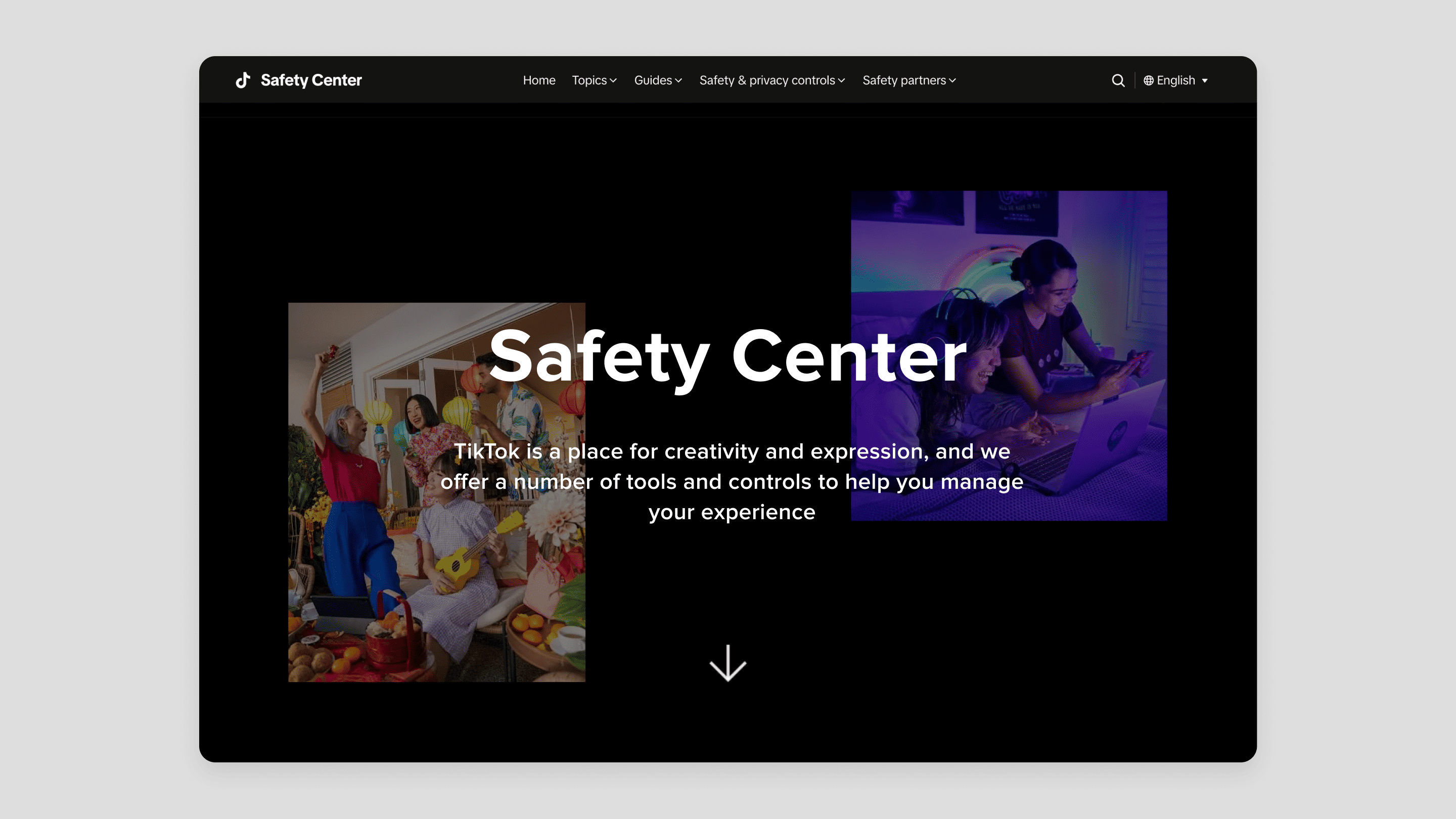
Outdated Visual Style, Lacking Brand Vibrancy:
The overall interface was inconsistent with TikTok's vibrant and creative brand image. It failed to effectively engage users with safety content.
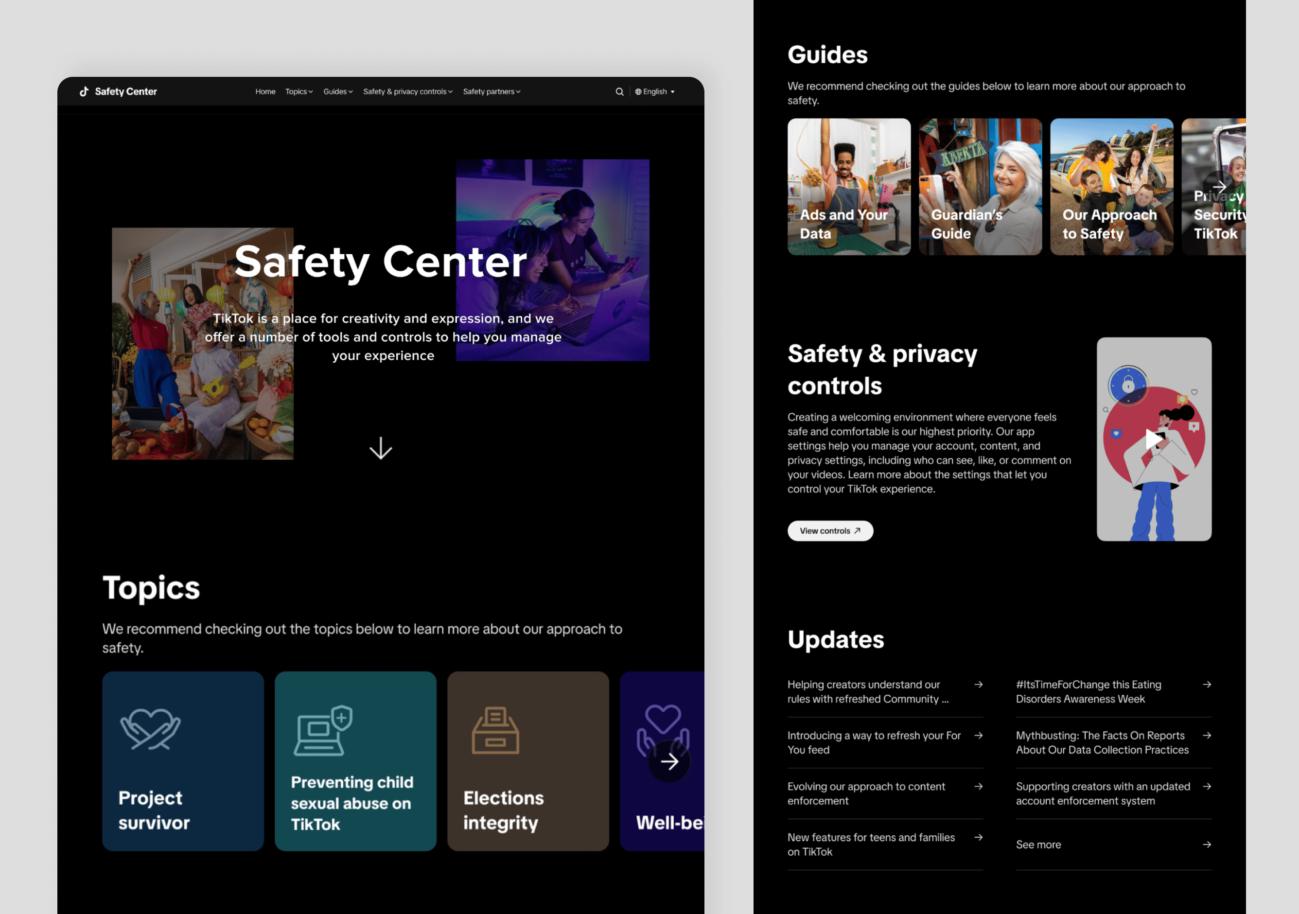
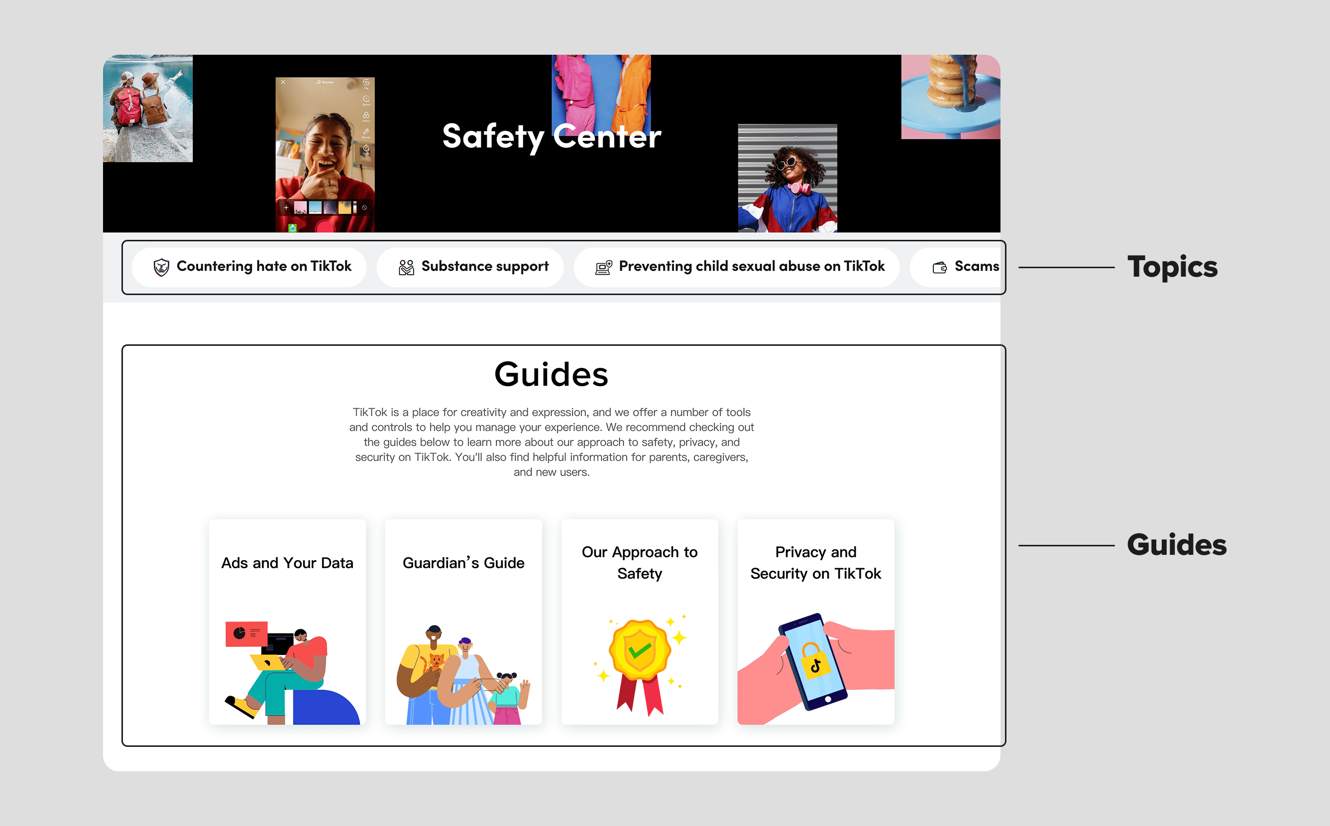
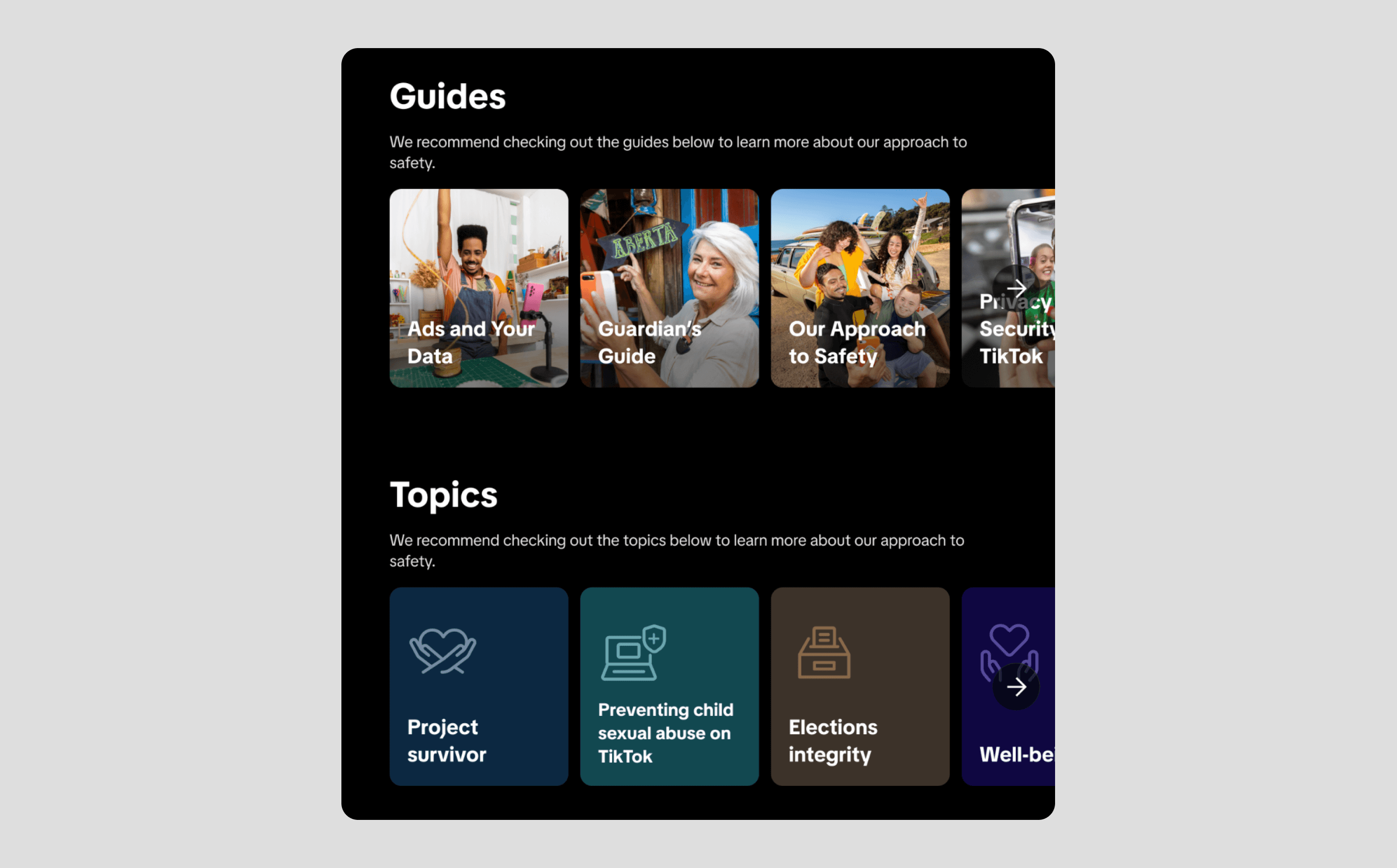
Confused Information Architecture, Poor Discoverability:
"Topics" and "Guides" are equally important content categories, but they are presented with vastly different visual weights and layout styles on the page (e.g., the "Topics" section features small, densely packed cards, while the "Guides" section uses large, widely spaced cards). This inconsistency can confuse users and make it difficult for them to quickly locate the information they need.
Monotonous Content Presentation, Lacking Appeal:
Most content was text-heavy, lacking visual guidance and interactive elements, making serious safety information seem dry and reducing user engagement and comprehension.
Low User Search Efficiency:
Users needed to spend more time and effort when looking for specific safety information, resulting in a less smooth overall browsing experience.
Design Goals and Approach
To address these challenges, the redesign set the following core objectives:
Enhance Information Discoverability and Usability:
Optimize the information architecture to ensure important content (like topics and guides) has a consistent and clear visual hierarchy, helping users quickly find what they need.
Refresh Visual Experience, Strengthen Brand Consistency:
Adopt a more modern, brighter visual language that aligns with TikTok's brand identity, making the Safety Center an integral part of the overall brand experience.
Enhance user trust in TikTok:
Encourage users to explore safety and privacy features through intuitive design, building trust and driving in-app action.
Key Improvements and Highlights
The new TikTok Safety Center achieved significant improvements in the following areas:
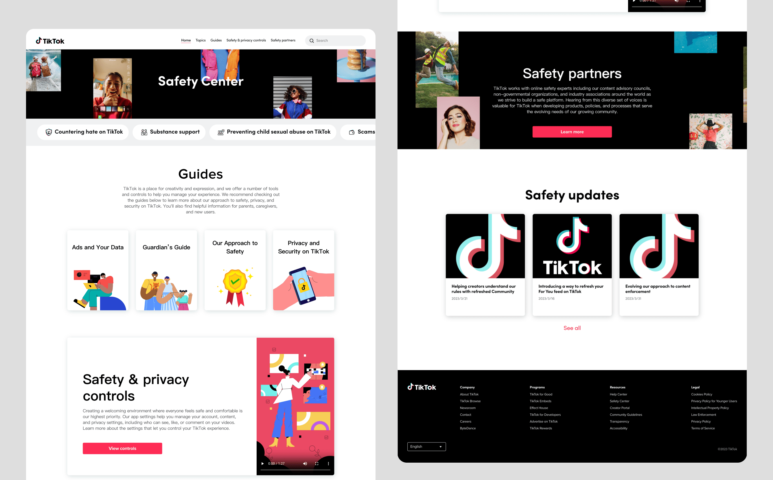
Modern Visual Refresh, Integrated Brand Identity:
The page adopted a brighter, cleaner color scheme, consistent with TikTok's youthful and trendy application aesthetic, enhancing the page's appeal and approachability, making serious safety topics more accessible.
Optimized Information Architecture, Enhanced Content Discoverability:
"Topics" and "Guides" were elevated to the same visual hierarchy, using a consistent card-based layout with prominent titles and illustrations, ensuring users can clearly browse and select.
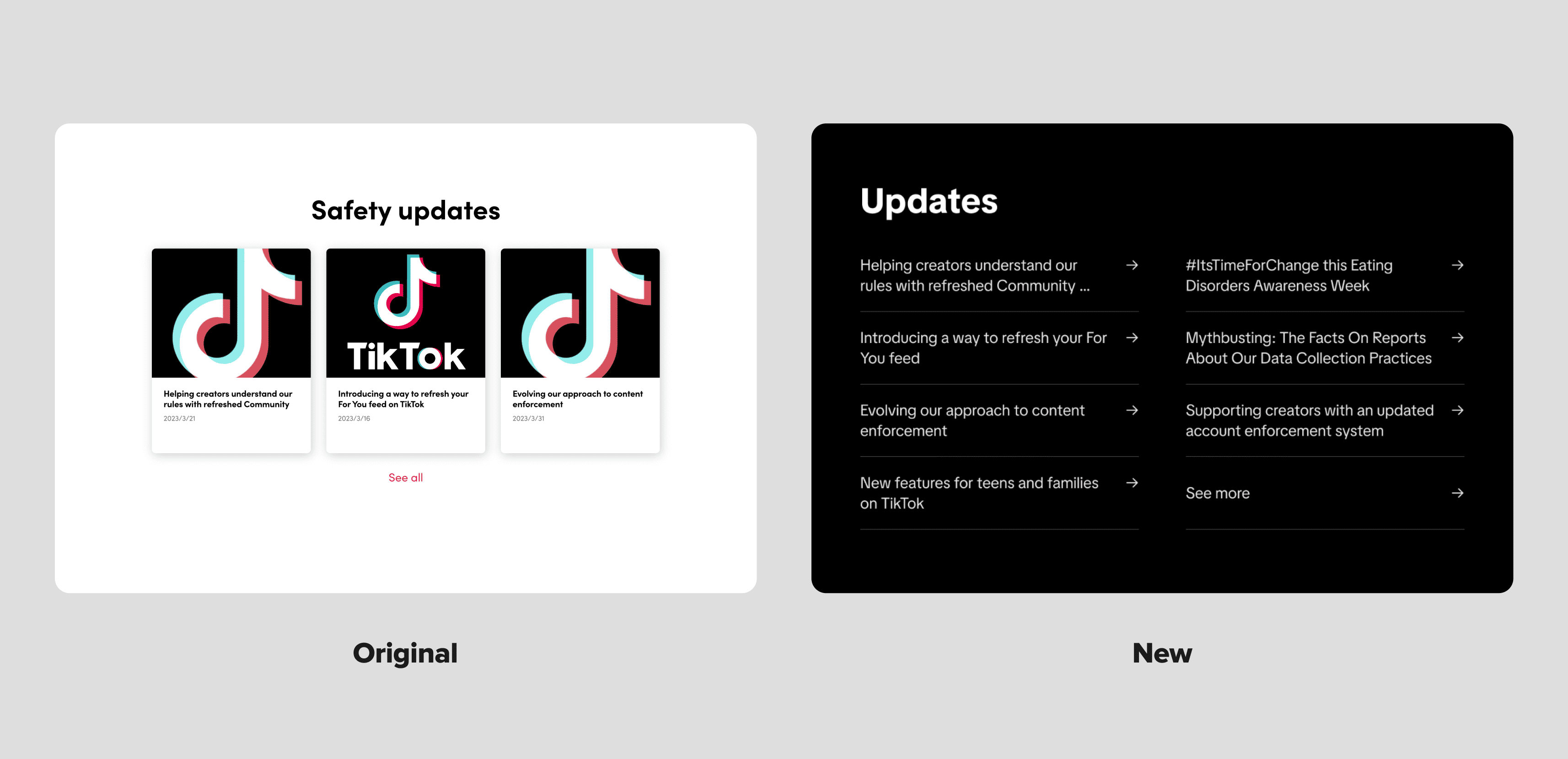
Optimizing Safety Updates for Clarity and Efficiency:
To improve information density and screen efficiency, I redesigned the Safety Updates section. Previously, news items were displayed as cards with repetitive images, limiting the view to only three entries. By removing redundant visual elements and focusing on the headlines, I increased the number of visible items and highlighted the most relevant information, resulting in a more streamlined and readable experience.
Refining the TikTok Safety Center for Better Usability
The redesigned TikTok Safety Center goes beyond visual improvements to deliver a clearer, more accessible, and trustworthy experience. It strengthens user trust, aligns with TikTok’s brand values, and promotes proactive safety behavior. By simplifying access to key information, it empowers users and reinforces TikTok’s commitment to a safe community. View the TikTok Safety Center.